


Marketing & Advertising
Lorain County Community College
The series of images were created in support of domestic violence awareness month. Beginning with the blue version of its on us, you'll see the finalized poster. This poster was chosen amongst the others because it reflected the brand's identity. In comparison, the red version was not clearly identifiable.
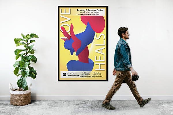
Moving on, you'll see a more artistic & futuristic poster that supports domestic violence awareness. The lack of excessive text leaves an opening for the viewer to reflect on themselves. Yet the subtle context of " Love Heals" is a reminder of what a healthy relationship consists of.
Finally, we have the Rave poster. This app was newly introduced to the college to keep students safe. From the lock shaped building to the location icon within the "v," this poster gets the point across very well. A QR code was added for convenience, considering the target audience is typically on the move.


Rise2Revitalize
This fantastic herbal-based company provides Lorain County with essential herbs to better the health of the community. It was a pleasure working with them to bring their vision to life. They were preparing to attend a pop-up event & needed marketing materials to promote the launch date of their website. And of course, thank you cards are essential for any business selling goods! Look at the Packaging Design, User Interface & Web Design & Visual Identity section to see more designs for this company.


Dennis Ryan
An iconic, no exaggeration, Graphic Design teacher at Lorain County Community College. While attending his class, I was given the task to create a syllabus for the various classes he teaches. These classes include Digital Photography, Typography, & Graphic Design Two. While including all the necessary information needed to succeed within the class, I chose to get a little creative with them. Oftentimes, when selecting classes, it is challenging to grasp the experience you'll have. The consistent color scheme gives a sense of familiarity with the teacher. That is also my reasoning for designing the syllabus within a classroom setting. Overall I did succeed in getting an A for this assignment.


Beth K. Stocker Art Gallery
The following flyers were created for an art show that was to be taken place in the spring of 2020. Of course, due to the new pandemic, the event was canceled. However, on the brighter side, this design successfully uniquely combined different mediums. The illuminated shapes used to display artwork on top of the subtly textured background blend perfectly. Now that I reflect, I would rather only use two fonts rather than three.


Fathers Day Ads
The goal of the following advertisements is to market to not only fathers but their loved ones also. With these ads, I was able to obtain valued clients who booked fathers day sessions for their loved ones. Considering the results, the masculine design & classical elements paid off to become a worthy investment.


